Tuesday, August 30, 2011

Periodic Table of Visual Methods

http://www.visual-literacy.org/periodic_table/periodic_table.html

The visuals are clunky, but the idea behind this is pretty sweet. If you go to the website each "element" is a rollover to help illustrate the element. Just like the scientific periodic table the elements are parted into categories.

Do you use any of these elements to help in your creative process?

Sunday, August 28, 2011

Vector Illustration


My illustration for this week is a little doodle of Wisconsin. I did not set out to make it  about Wisconsin. I had started with the sky then the hills. It felt like it needed a cow, and cows make me think of Wisconsin. I started on computer, though I would prefer to start with a sketchbook, then scanning, then vector work on the computer.

Each project has its own process. What is nice about non-work work is that I don't need to be as strict in my discipline. I do what I feel like.

Friday, August 26, 2011

Constant Vigilince...

Is difficult. Lately I have been having trouble staying motivation. It seems once you start having a goal things just get thrown at you to make it more difficult to meet those goals. It was easy at first to want to draw, update my site, and look at type. It started with being active (that is always the hardest for me in my married life, I am not sure why). Then other things started falling off the list, and with the list went my motivation. I might have just gotten it back! My local AIGA had a Pecha Kucha event. The purpose of the event was to show what creative individuals do when they are not being paid to be creative.

Some of the speakers shared hobbies that I also enjoy when I am not at work: creative desserts, photography, loved ones, and reading. More than finding common bonds. I have gotten some of wind back. Some things that have become more crucial the more I design: always a student, have passion, curiosity, and have fun. If it is not fun then I cannot do my best work.


--------- AND ---------


I did have a mini kitchen adventure: ( I don't count it as an adventure since I have made lemon bars a few times before).  this exact recipe was a first. I have a few suggestions if you make it: 1.5 sticks of butter instead of 2 will make just plenty. If you want you can just half the crust and make the same amount of filling, or you can 1.5 the recipe. I had 3 lemons so I just made extra filling. The original recipe has too much crust to filling ratio. So I suggest either the crust gets less or the filling more.

Wednesday, August 24, 2011

Minimalist Movie Posters

It is no secret that I love simplicity. These posters really tickle my fancy! (whatever that means.)


Monday, August 22, 2011

Love: &

I have another type specimen to drool over. In general an ampersand is a beautiful character, but I wanted to share my favorite one of all. This is the Adobe Caslon Italic ampersand. Obviously this was named after its founder: William Caslon. This is another serif typeface, but unlike the Baskerville Q, this is an Old Style typeface. The thicks and thins of the strokes are not as prominent. This typeface was named after its founder: William Caslon.  The first printing of the Declaration of Independence was set in Caslon.


The ampersand has a long history in how it came to being. It originally was "et", which is visible in this letterform. The ampersand continually transformed into the figure it is today, but being an older typeface you can still some of its early roots. If you have a favorite ampersand please share I can always look at more of this elegant letterform.

If you want to learn more about Adobe Caslon, check out these links:

Saturday, August 20, 2011

QR Codes vs Microsoft Tag

I am just starting to use QR codes with my clients, but I have been seeing more and more about Microsoft Tag. It uses CMYK colors to create a code. These are high capacity color codes, that can hold more information than a QR code can, but the Microsoft Tag code reader is not as common as the QR scanner. QR scans can be used in BW (which is common for cheaper prints and newspaper ads). Microsoft Tag must have CMYK. Both can be branded with image. QR codes can be colorful as long as the contrast is high enough. Microsoft tag can do both black and white and any color of the rainbow; but, the Microsoft tag can be transformed into images and icons more easily than QR code without losing readability.

Microsoft tag is a great way to continue your brand, while being functional. Some people believe that Microsoft Tag will replace QR codes. I think it's more likely they will co-exist until they are replaced by something else. Currently simple Microsoft Tags are free, but the website states that they will charge in the future for anything more than the basic features. 


There are enhancements sites for QR codes as well, and they also charge. The original QR code has a license that is not be exercised by the creator. I doubt that would happen with Microsoft tag. You have to have an account with Microsoft tag (it is simple: just your hotmail or msn account), but something very beneficial about this type of coding is there are analytics that Microsoft manages for you for your code. Codes could be "temporary" in that they would exist within a pre-arranged time period, which creates a valid reason for Microsoft to limit who can create their type of coding. There could be too many codes interfering to make relaying information difficult. 

Enhancements to either code do not have to be done my expensive sites, but by you through Adobe Illustrator, but unless you are skilled in the program you would have a difficult time developing the image, while allowing the code to still connect to your information. Skills could save you some doe, but it can save effort if you want to use what Microsoft already has available.

This Microsoft Tag Code links to my website, but I limited its availability until the end of this month.

Thursday, August 18, 2011

Linoleum Illustration

For this month's illustration I went the analog route. I freehand cut a linoleum block and made a simple nesting doll stamp, that I have put on a few cards. If you would like one (email me your address, and I will send one to you!) I love way the lines become thick textured lines from the way the knife pulls at the linoleum (if you are having trouble carving you can always use a hair dryer or iron it heat it up, then it carves like butter!)


Wednesday, August 17, 2011

Laundry Day

It's laundry day, and since we can only wash one load at a time I sit with nothing to do for hours. I had lent my SLR to my brother, so I only had my phone to take pictures with. It always surprises me the advancement in technology. MY first cellphone 5 years ago was a little flip phone, with no camera at all. I bought my second phone one year later, because the flip phone had split in two along the hinge. This new camera had a 1 megapixel camera in it. The images were not the best, but could be a great way to communicate with some grainy and pixilated  images. My next phone I replace 2 years later, when my contract expired. this phone has a 2 megapixel camera. It was better, but it is still grainy and blurry. Then in March I replaced my phone again when I switched carriers. My latest phone has 5 megapixels and takes photos like this:


Okay I am no William Eggleston or Cartier Bresson or Diane Arbus, but these photos strike my fancy a little. Taking photos can be a great way to pass the time, while being creative. Technology is a allowing us to this with smaller and smaller equipment. I still would have rather pulled out my SLR, but this little phone camera did well to fuel my creative outlet. What do you do while you wait for laundry?

Monday, August 15, 2011

Kitchen Adventure #2

A lot of Kitchen Adventures have been occurring recently, and this one is courtesy of my latest lazy Sunday afternoon. Eggplant has been a standard item in our fridge the last few weeks, but it has always ended up the same thing: eggplant Parmesan. It is tasty, but I wanted something new. I have been thinking a lot about the best pizza I ever ate. It was from a college pizza parlor across the street from Harvard. It was an eggplant and onion pizza. I realized I had all the ingredients to try to recreate this for myself.


Homemade Pizza Sauce: 2 Tablespoons of olive oil (let it get warm/hot), toss in one minced clove. Add 1 can crushed tomatoes, 1 can tomato sauce, 1 tsp of the following: basil, oregano, and marjoram. Mix and bring to temperature. Add a bay leaf and let simmer, while you prepare the rest of the ingredients.


 A little bit of but and semi-circles of onions. Do not cook them completely, they will cook a little more in the oven. (I think red onions would have been better, but I used what I had around)


 Sweat the eggplant first with a little bit of salt. Let rest for 30 minutes to 1 hour. Cooking with a little bit of olive oil. Just like the onions, do not cook completely because it will cook more in the oven. (These would have been really great if I could have grilled them.)


First things last I guess. You have to make the dough first because it takes so much time. Mix together 1 pkg of yeast (or 6.5 tsp), 1 cup warm water, 2 tsp sugar, 1/4 shortening. Once mixed ad 3 or 4 cups flour and 2 tsp salt. Once the dough scrapes the side of the bowl it is done. Let it rise in a greased bowl for 1 hour (it should have doubled in size), and then divide into two balls and let them rise for another 20 minutes. You can just roll the balls out, throw on some sauce and arrange ingredients however you like (I threw on some mushrooms too).

This was a tasty success in my household, it could have been better. My additions have been marked in italics for an even tastier pizza.For me nothing beats homemade pizza and the wonderful smells emitted in the process: bread-making (always smells like home), onions and garlic sizzling in oil, and the smell of the flavorful tomato sauce simmering on the stove. MMMmmm can't wait for my next kitchen adventure.

Saturday, August 13, 2011

Illustration Aspirations

I am trying to work through my goals, and someday I want them to lead me to a place that has me sketching and creating like this:


our creative process/. 01 from Casey Warren | MINDCASTLE on Vimeo.

Friday, August 12, 2011

Kitchen Adventure #1


It was a sweltering  110° day in Kansas, and all I wanted was a delectable slice of cake. Tyler doesn't like cake, or most sweets actually, (what is wrong with him?) so I try to limit my baking if possible (especially with this heat). Since Tyler was on a health kick for about 2 weeks and we had lots of fruits and veggies going to waste in our fridge that I would whip up some peach cobbler.  Okay, not super healthy, but it has fruit. That counts right? 

Recipe for Quick Peach Cobbler:

1/2 stick of butter
1/2 cup of flour
1 tsp baking powder
1/2 cup of sugar
pinch of salt
1/2 cup of milk
1/2 tsp of vanilla
3 peaches or 2 cups

Preheat oven to 400°. Melt butter in 8x8 or 9x9 or 7x9, it doesn't matter. Mix the flour, baking powder, sugar, salt, milk and vanilla together (it will be runny). Pour batter over the butter, and then place cut up slices of peach on top of the batter. Bake for 2530 minutes. It will be golden with a little darker around the edges. This a delicious treat and took me only 35 minutes from beginning to end. 

Peaches are a beautiful fruit!


Wednesday, August 10, 2011

Goals: A Formal Announcement

Not too long ago I answered a question posed by GeneralOverachiever about managing creativity. I talked some big talk, but very little commitment. Lists and sketchbooks help me define my goals, but I have discovered that they to not inspire me to complete the work I have set out to do.  I am more prone to do something if I inform others of my goals. The thought that others could hold me accountable, makes it easier to force myself do it. I believe all of these goals will help me to be a better designer, employee, blogger, and person. 

_____________________________________________________________

 LIST OF GOALS
_____________________________________________________________


YEARLY:  Go or do one thing out of the norm or at least out of WICHITA.

BI-ANNUALLY: Update my website (at a minimum)

MONTHLY:  Have a food adventure in the kitchen.

WEEKLY:  Create an illustration every week. Whether simple or small I need to create something for myself every week.

EVERY TWO DAYS: Continue to post every other day, or sometimes more often!

DAILY:  Do something active and engaging every day.


CONSTANT VIGILANCE: I want to constantly observe and engage in typography around me, and particularly the typography I use and create.

Let's check back in one year and see if I have accomplished my goals! Do you have any goals you are hoping to attain in the near future?

Monday, August 8, 2011

Type Love: Q

No not Bond or Star Trek, but Baskerville. The Q designed by John Baskerville is striking with the eloquent curved strokes. In all typefaces this is my favorite Q, and I just wanted to share a little bit on the history of one of my favorite letterforms. Baskerville is a Transitional typeface. To the average person the biggest difference you will notice with Transitional faces is the stroke contrast is more prominent that Old Style or Humanist typefaces.


This typeface was designed in 1757. I am not alone in my fandom. Fournier, Bodoni (another typeface designer), and Benjamin Franklin were all fans of his work.The tail of this "Q" is what makes it so sensational.

Want to know more about this typeface? Check out these links

Saturday, August 6, 2011

Quickly Responding (this month)

I had seen QR codes, but I had never used them. This past month it seems like all of our clients are requesting QR codes on brochures, posters, and ads. I have had to learn about these little codes for my clients. QR stands for Quick Response Code often linking from the code using a mobile app to connect to a website. Up to 7,089 characters can be encoded in these little squares, where as a traditional barcode is only 20. It carries information vertically and horizontally, which is how it can hold so much information. It even has error correction built in. Data can be restored if then is up to 30% of code words are damaged.

These codes are easiest to use if they are black and white, but as long as the contrast is high enough the code can be read in any color. But after experiencing a frustrating QR scan from the newspaper with 4 colors I would suggest keeping the code simple. It is great to have a pretty code, but if it doesn't function it is pointless. Since 30% of the data can be damaged you can take some risk in creating images within the code to give it an extra detail and design.

Shelby Montross of Meadowlark Creative.
I love the simplicity the QR code enables
this business card to have.


There are several sites out there that allow you to generate QR codes, and usually give you a choice of file type, size, and sometimes: color. QR codes can be great to put on business cards, to drive contacts to your portfolio or website. They are also good for  promotional pieces, such as posters where people can link to the event site or a location to buy tickets. It is most helpful on long/specific website addresses. If it is something short and easy  to remember: like apple.com, it is probably not worth the extra effort to develop a code.


There are a variety of mobile codes that you can use (but not all apps can read all codes). Some codes  to choose from are QR code, Color Code (microsoft tag), Shot Code, Maxi Code, Aztec Code, Tillcode, Semacode, and EZCode. QR codes were developed by DENSO Wave, and prominent in Japan and has taken longer to become popular in the United States. Has anyone else experienced an increased use of this QR code, particularly in your own work?


Some good resources to check out if you are interested in using QR codes in any marketing that you are doing:

Thursday, August 4, 2011

Something Wicked This Way Comes

For me it is never too early to start thinking about Halloween. With the recent Harry Potter bonanza I think I want to make my Halloween Harry Potter themed. A party is the mood, decor, and of course the food! Using orange paper lanterns with painted faces create the feeling of the floating jack o' lanterns of a Hogwarts Halloween. And strings of paper bats to float along the ceiling. With some construction paper I can have a festive apartment. A various spread of "potion jars" only add to the effect. I try to collect interesting jars when I can, but I need to create some interesting labels for my potion jars.


For the food pumpkin soup or some English foods to give that Hogwarts feel: such as Sheppard's pie. I am interested to try Butter Beer, not sure how warm butterscotch soda will taste like. I do love this Harry Potter Bento. Since Halloween is on a Monday, maybe I should make a lunch like this. 


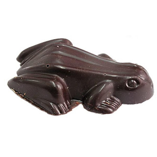
Halloween is a holiday that is about the candy and desserts. Whether is pumpkin pasties, licorice wands, chocolate frogs, Bertie Botts (or just a mix of jelly beans), and cake pops in the shape of pumpkins and cauldrons.


Do you have any plans for Halloween?
Here are some links to find Harry Potter or Halloween party ideas:


Tuesday, August 2, 2011

Living Green


First of a series, I am hoping. I started with the easiest color to show in my home: green. Since it is my favorite color I knew that I would find a lot of objects in my home that were green. Do you have colors that you are drawn to, and that seem to pop up everywhere?