

Showing posts with label movies. Show all posts
Showing posts with label movies. Show all posts
Thursday, February 7, 2013
Dark Inspirations
Another inspiring hero of mine is Tim Burton. He definitely has his own style, a true artist who happens to be highly successful. My first Tim Burton film (he was a producer) was James and the Giant Peach; I love the stop action animation and the charisma he provides these characters. The Melancholy Death of Oyster Boy & Other Stories is dark humor stories and poems of Tim Burton's own creation. In college I was inspired by this collection for my own small story "Creature by the Sea". My favorite films tranfer constantly between Big Fish, Edward Scissorhands, and The Nightmare Before Christmas. I can watch any of his films and be inspired.


Thursday, January 17, 2013
Merry ol' land of Oz

Wednesday, September 26, 2012
Jiro Dreams of Sushi
I love devouring documentaries on Netflix, but this one has me salivating. Jiro Dreams of Sushi is a beautiful story of a world renowned sushi chef. He is over 85 years old and still works hard everyday and considers each piece of sushi his chance to improve himself. I just imagine if I had that kind of passion in my own work.
You become the best not just by being talented or have the desire to be the best.
You become the best not just by being talented or have the desire to be the best.
"Even at my age, in my work... I haven't reached perfection."
Constantly striving for better work and perfection is what helps this world be filled with good design, ideas, and for Jiro—great sushi. The message that is continuously repeated in this documentary was the choice of self-improvement. Hard work is not easy, but that is how you get to be the best at what you are passionate about. Each day and each project that I get to work on is just practice for my work to come, and I should do my best. Now I need to find some tasty sushi to savor.
 |
| Source |
Wednesday, July 18, 2012
Art of Logo Design
I recently subscribed to OFF BOOK by PBS. It is a great station to check into science, technology, art, and design. Today's clip was very satisfying. Enjoy!
Tuesday, October 4, 2011
Favorite Videos
Here are some of my creative videos that I have seen lately:
Doc to Dock "SOS: Save Our Supplies" from Shilo on Vimeo.
Louise Attaque - Du monde tout autour from ChezEddy on Vimeo.
A SHORT LOVE STORY IN STOP MOTION from Carlos Lascano on Vimeo.
Doc to Dock "SOS: Save Our Supplies" from Shilo on Vimeo.
Louise Attaque - Du monde tout autour from ChezEddy on Vimeo.
A SHORT LOVE STORY IN STOP MOTION from Carlos Lascano on Vimeo.
Saturday, September 24, 2011
The Bane of Avatar
Remember when Avatar came to theaters in 2009? Besides being a more fantastic form of FernGully , the most disappointing feature of this movie was the use of Papyrus. This movie is estimated to cost $280 million, and I was surprised that they would use a common, crude, and un-liked typeface for a movie of this epic a proportion. With all this money spent, it would have been small change to develop their own typeface or spend a couple hundred dollars and buy one with more unique, and less offensive styling.


There is an entire site dedicated to all of your papyrus sightings. It's everywhere. Where have you seen it today? Apparently James Cameron did a slightly customized typeface with a few alterations. Either way, why emulate a bad typeface so closely?

- Skylark : This typeface has similar attributes to Papyrus: distressed look, extended ascenders and descenders.
- Baker Signet Roman: This one is not distressed but has similar ink quality to it, with the thick and thins of the lines that make up each letter. The ends are also come to a point like Papyrus
- Solano Gothic: This one is not like Papyrus at all, but because of its condensed letterforms and the unusual short descenders and ascenders with curved edges.
- Eurostile: Similar to Solano this also has the feeling of being sci-fi without the illegibility. TI also has short ascenders and descenders.
There is an entire site dedicated to all of your papyrus sightings. It's everywhere. Where have you seen it today? Apparently James Cameron did a slightly customized typeface with a few alterations. Either way, why emulate a bad typeface so closely?
Wednesday, August 24, 2011
Minimalist Movie Posters
It is no secret that I love simplicity. These posters really tickle my fancy! (whatever that means.)


Thursday, August 4, 2011
Something Wicked This Way Comes
For me it is never too early to start thinking about Halloween. With the recent Harry Potter bonanza I think I want to make my Halloween Harry Potter themed. A party is the mood, decor, and of course the food! Using orange paper lanterns with painted faces create the feeling of the floating jack o' lanterns of a Hogwarts Halloween. And strings of paper bats to float along the ceiling. With some construction paper I can have a festive apartment. A various spread of "potion jars" only add to the effect. I try to collect interesting jars when I can, but I need to create some interesting labels for my potion jars.


Do you have any plans for Halloween?
Here are some links to find Harry Potter or Halloween party ideas:


For the food pumpkin soup or some English foods to give that Hogwarts feel: such as Sheppard's pie. I am interested to try Butter Beer, not sure how warm butterscotch soda will taste like. I do love this Harry Potter Bento. Since Halloween is on a Monday, maybe I should make a lunch like this.


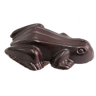
Halloween is a holiday that is about the candy and desserts. Whether is pumpkin pasties, licorice wands, chocolate frogs, Bertie Botts (or just a mix of jelly beans), and cake pops in the shape of pumpkins and cauldrons.




Do you have any plans for Halloween?
Here are some links to find Harry Potter or Halloween party ideas:
Monday, July 18, 2011
Simple is Better
I went to see a movie this weekend, and was amazed the best movie poster was not for the movie I was lining up to see.

With the busy posters around it, the most striking poster is the one for Winnie the Pooh. In common with Harry Potter, there is not name listed. Pooh is iconic enough that he needs no names just a poster full of honey and pooh and his friends float to the top. The bright colors helps too against the darkness of the other four. Well done Disney for a beautiful poster. It definitely stands above the rest.
With the busy posters around it, the most striking poster is the one for Winnie the Pooh. In common with Harry Potter, there is not name listed. Pooh is iconic enough that he needs no names just a poster full of honey and pooh and his friends float to the top. The bright colors helps too against the darkness of the other four. Well done Disney for a beautiful poster. It definitely stands above the rest.
Subscribe to:
Posts (Atom)