Wednesday, June 29, 2011

Tutorial 1.Halftone


A couple weeks ago I promised to start putting tutorials on my blog. Here is my first project for you to try. 
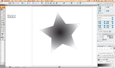
A Halftone Vector Shape.
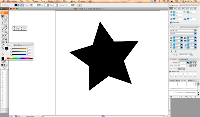
Step 1: Make a shape. Any Shape.

Step 2: Give that shape a gradient. I am using a radial gradient for this tutorial.

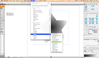
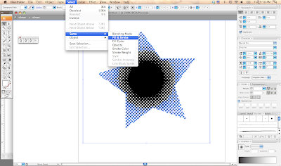
Step 3: Go to Effects in your tool bar and select Sketch: Halftone Pattern.

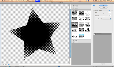
Step 4: Adjust your size and contrast to what you are happy with. I prefer my contrast high, so that the dots get better separation.


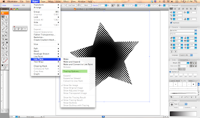
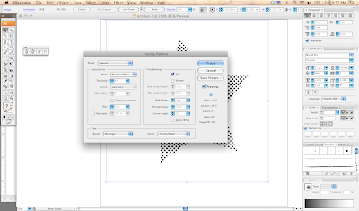
Step 5: Rasterize the shape. Then go to Object : Trace : Tracing Options


Step 6:  Adjust your tracing options, until you like the appearance (I always check the preview box so I can see my adjustments before I make a commitment. Trace & Expand the Appearance (so that it all become outlines)

Step 7: Select all the white areas, and delete. This way you are only left with the black.

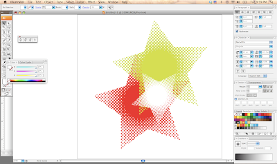
Step 8: Now that we have the halftone pattern shape as a vector, we can make any size and color.


Please let me know how this tutorial went (it is my first and I am learning at doing this myself, so if anyone else has some helpful hints please leave a comment below). Also if you would like to see more tutorials or a tutorial for a particular project in mind just let me know! I tried to be clear in my directions, but if anything was confusing or needs definitions please let me know.

Thanks.

Saturday, June 25, 2011

Love'n It!

Bottlecaps and Buttons!


Right now I am obsessed with bottlecaps and buttons/badges. Something about these small circular shapes feel friendy and  lend themselves to many different and intriguing designs. Type or image, a bottle cap has to carry the brand in that 1 inch space. Some use both, and designers can run the risk of putting too much into too small space. The FreeState cap is text based but has used the unusual background of a watercolor-like texture to its background. Most often you see bottle caps as a flat color with image or type, typically the logo mark. I posted a bottle cap with an owl, and it is a favorite of mine.

Bottlecaps have been collected by thousands, maybe millions of people before me. Typically people are looking for something to make wall-art out of or for the interest of the liquid that was inside of the bottle. There are many too, like me, that enjoy it for the artistry and design of this 1 inch disk. With buttons/badges being trendy for the last few years there are many websites dedicated to making the miniscule design pieces. Other designs, such as mailers and emails, do not have the vitality that a bottle cap or a button could have. You want someone to pick up your "flash" and take it around with them and show off the brand and your skill.

Perhaps I should make my own tiny design?

Some sites to check out for printing buttons are:
Wednesday, June 22, 2011

Layers

Advances in software technology has increased the ease of making designs, particularly with layers. I have been watching old episodes of Buffy the Vampire Slayer. The dvd menu is a bit of a layered jumble of faces, patterns, textures, and effects.

Initially when software enabled layering and the ability to add effects of transparency led to some caotic designs. It was popular for a time. Layers are still used in most designs, but busy layers have transformed to more subtle variations.

Layers are a great tool for adding depth and interest in a design. Layers can be complicated to manage in a design so it is important to keep your layers organized from the beginning. The layers palette in adobe products can be useful to manage your layers by locking or making certain layers invisible.


The above is photos I took of my tv and opening sequences to puffy. There are layers of faces, backdrops, texts, shapes, and lighting effects. I would say this was common for designs from late 90s early 2000s, but now layers and textures mean this:


The top image is an Adobe ad for CS5 by Philippe Intraligi and you can check out his work on the behance network. The second is Mad men. Using layer to create perspective and a more true sense of depth (rather than the Buffy layer of images). And although the Adobe ad is very busy and colorful it still makes sense and organization which is missing from the Buffy screen shots.

There are a lot of things you can do with layers, and the best thing is to have some fun and experiment.


Tuesday, June 21, 2011

Takashi Murakami

I saw Google today, and I was thrilled! Takashi Murakami is one of my favorite Japanese artists, of course he is also one of the most famous. His work is very inspiring with his cast of characters, bright colors, and his somewhat inappropriate subject based around anime culture, particularly otaku. He us well known for his "super flat" style and his work in varying media.
Here is some of his work, and this is just a small portion of his work. He has worked with major companies such as Louis Vuitton.


Monday, June 20, 2011

Nostalgia

Nostalgia design comes and goes, but right now it is popular and for good reason. Nostalgia is meant to bring up fond memories and connect your audience with their past or a sense of belonging. Antique, vintage, and retro can call to find different parts of our past even if we did not live through them. Perhaps the reintroduction of the barrel lamp reminds you of something your grandparent had and you feel a connected sense of warmth.

This is popular in graphic design has well. Throw back designs are everywhere today I spotted a throw back design for 7up, which was very 80s in style. Perhaps this the packaging teams way of connecting with the 80s fashions that have come back in trend.

Old can be new again. The Nostalgia movement has also brought back the craft movement. Which has encouraged some designs to "cheat" to make things look hand printed with subtle variations of tone and texture. I think this is a fun look, and I hope it sticks around awhile, and it brings back the true artist and craftsman.

If you are interested in designs of the past check out Vintage Me Oh My!

Tuesday, June 14, 2011

Hitachino Nest


I am not a beer drinker, my brother would not let me have it anyway, but I love label design on alcohol. This particular beer has a fun owl, which has a modern woodblock feel to it.

Their different beer varieties have this sixties-ish type which is a bet odd to me, but what I love is their color choice and there logo/icon. It reproduces well large and small. The illustration has whimsy and texture. It's round shape fits well on the bottle cap.


Sunday, June 12, 2011

Always a Student

Life often requires that we be constant learners, but as a graphic designer I seek out knowledge. "Knowledge is Power" I guess all those cheesy movies i was forced to watch as a child has fully brainwashed me. I crave learning, whether it is learning new techniques, new coding, or subjects completely separated from graphic design.

The internet is a quick easy source to develop further knowledge on almost any subject. I learn best by doing myself, so i can read as much as I want, I do not fully comprehend the words until I delve into it with my own hands.

With all of this being said, I plan on starting a section focused on tutorials or educational posts. If you have any subjects you wish to discuss or projects you wish to learn please leave me a comment. Not only can this be a helpful contribution to the design community, but more selfishly it will help me practice and learn useful skills. I am excited for this new endeavor.

In the meantime here are some good sites if you want to learn something new:

Friday, June 10, 2011

Iconography

An icon is simply: a representation or if you want to ad to it: a representation that stands for its object. Iconography is becoming more entrenched in our modern visual culture. We see icons on the apps on our phones, street signs, and even in our browsers.

I recently designed the new website, and we decided to use iconography for the navigation. It was challenging, yet fun to come up with icons to use for this site. Icons are almost simplified logos. A logo acts as an icon for a business, but usually more meaning is involved versus an icon. Icons are typically made as simple as possible, because they are used small and need to be universally understood. Icons were some of the first art made by humans. Simple figures that stood for people, weapons, and animals. A way of recording culture. How we have created the symbols has changed through the centuries. We began with simple cave paintings, added color, then used more developed tools for etchings and other art making techniques at styles, and now we have computers and the cellphone has really sparked a new need for unique yet universal icons .

We need unique icons for the personality, customization, and style that we crave as a way of expression. Companies needs the uniqueness for brand identity. Universal icons are needed become a global society. Icons need to relate across cultures and languages. Because we have this rich history in iconography there are still many styles and techniques used for making icons, but there has been a return to simple illustrations, due to the nature of cellphones. The icons used on cellphones (smart and not so smart) and it is difficult to read an illustrious icon because the detail will be lost in small sizes. App icons help us identify the program we want to use and assist us in a quicker many than we would be able to with words.

I encourage you to observe the world around you this week and identify the icons around you, and make some icons of your own to some how help facilitate your life in some manner.

Thursday, June 9, 2011

Back to Basics


With all the jazz we sometimes ad to our designs, such as graphics, textures, layers, effects, and multiple type treatments it can be refreshing to get back to basics.


These packaging examples prove that simple and elegant type along with simple color fields can make simple look expensive and intriguing. One typeface: Helvetica, it is always a safe bet using Helvetica because it is simple clean and never fussy. Helvetica also gives you many styles and weights to choose from. I also goes to show generic does not need to look cheap.

As I mentioned in Getting the Right Kind of Attention http://designmorsel.blogspot.com/2011/06/getting-right-kind-of-attention.html

It may seem easy, but have a simple and unfussy design can be the more difficult to accomplish. I encourage anyone who is reading this to take a look at your work this week and remove the excess and leave the essentials to a design. Using simple black and white can be elegant and save your client money. Giving yourself a challenge is a great way to bounce off new ideas that would not happen in the same way if you did not give yourself any restrictions.


A recent birthday card I made from my brother. Really simple just black and white. He has that modern aesthetic so this really fit him for me. I could be a little more fun with the interior of the envelope for a surprise punch of color. This was my attempt at going back to basics could clean type. Maybe a little boring with Helvetica, but it is always a classic choice.

Tuesday, June 7, 2011

New app

Having recently became addicted to my phone, I try to do everything I can on my phone. I have had the blogger app for a couple months now, but it has been a hassle to post most things. Adding links or type style was something limited to my computer. But the latest update from google has made it easy for me to blog on the go, which is perfect because most of my ideas do not come while I have time to sit by my computer at home.

Not that there aren't dome bugs that still need to be worked out. I am looking forward to the new opportunities this may bring, and hopefully I won't be so engaged that I disengage.

Monday, June 6, 2011

Fluid Color


I have been watching a lot of anime recently. I obviously I love the story line and characters, but I find myself paying more and more attention to the background. Often it is water colored and the beautiful tones that the paint makes with the water is just something I cannot recreate. My grandmother has only begun her painting career in my lifetime and this year alone has had her first solo exhibition and been in several galleries. Watercolor illustrations can be a beautiful way to ad color and a sense of fluidity to a design. I am not much of an illustrator; I only dabble. But at my grandmother did not start until her 50s, and look at her now. She is proof that it is never to let to start a new career, and love what you do.

Continually to broadening your skills is essential, particularly in this market. The more you are personally capable of is attractive to a potential employer or client; just make sure it is your best work of course. Often in this age skills are thought of as computer competency, but skills off the computer are just as important. But more about that on another day.

I think I will try to add some watercolor to my work, probably my personal work, even it is as simple as background. That mysterious gradation of color will add a look that I have never had before. What is important for consideration is to make the painting to fit the concept of the work, not the design fit the painting. 


The Little monsters were my attempt at watercolor characters for Halloween.

Friday, June 3, 2011

Getting the Right Kind of Attention

Sometimes working on ad can be like teenage girl applying makeup. Clients can be prone to fall into the more is more category. "That type needs to bigger, bolder, more brighter, wider, and more content, and don't forget the!!!!!!!" You want your clients to be able to trust what you are doing as a designer, but sometimes they don't believe you can sell their sale with clean type and striking simple copy rather than all bold large and very full ads. Honestly all this busy-ness creates distraction from the sale more than anything else.

Especially when you provide a quality product to your customers, you should be willing to look for quality design as well. One one to get clutter off the page is to drive people towards your website or social media account. You can provide full details of the sale or product in digital rather than in a printed. Of course the most important information should be visible and stand out, such as the sale name, date, and time. Percentages and amount can be useful to grab the consumer's attention. And this information should use a variety of sizes and weights to draw attention to what is most important. If everything is large it is hard for the consumer to distinguish between information.

Be careful on any graphics you use to enhance the ad. The graphics should be fitting in quality to you product and help attract the right customer. It could be photos of your product or photos of how you want your customer to feel about their 'purchase'. Or graphics that fit the style of your intended customer. But if the graphics take away from your message or make the ad too busy it is not doing you any good and it should be removed or possibly simplified. Sometimes the photo or illustration can have too many elements that draw too much attention to themselves.